Friday 13 November 2015

Medieval Battle


"Expanding Comfort Zone" part...next. One of the most important aspects of a good portfolio is showing an ability to draw various themes (do not confuse with variety of styles!). When browsing through my old portfolio I encountered medieval buildings, steampunk buildings, fantasy buildings and some existing buildings. In short - it was quite monothematic. Ok, maybe I'm exaggerating. There were also guitars. Still, it was quite far from presenting diversity of themes.

My portfolio needed more people, more animals and more dynamism (nope, torn Ghost Ship's sails  flapping on the wind don't really count as "dynamic"). How about a battle scene? It usually requires participation of a group of people, right? Dynamism is also automatically incorporated. Let's add animals in the form of horses and we will have a complete package.


1. Tadaaaa:

Not oh-so impressive, I know. Luckily it's just my 2-minutes chaotic sketch. Hopefully the final result will be a little bit better.

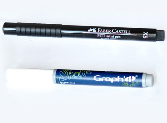
2. Detailed pencil drawing. The more details are drawn with an easy-to-erase pencil, the less decisions need to be made during the watercolor part:

3. The background. It's almost invisible, but I prefer to keep it very delicate at this stage. Probably after painting these fighting guys, I'll add more contrasts or details to the background. In case of watercolors adding it's always easier than withdrawing.

4. The fighting guys and their brave steeds, stage 1. Tiny little details will be added later.         

5. The fighting guys and their brave steeds, stage 2. Tiny little details were made with brown and white opaque ink. 

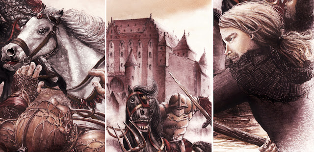
As suspected also the background needed further treatment to form a coherent whole with the characters. New layers of warmer colors were added to the sky, the castle and the rest of the environment.

And they lived happily ever after... 

Thursday 29 October 2015

Snow Queen


Recently I decided to enrich my portfolio with an illustration for a classic tale. After short considerations my choice fell on "Snow Queen". 
I had a very clear idea in mind, both regarding composition and details. It doesn't happen very often, but this time I didn't need to make a single concept sketch (tripple HURRAY! as I don't like to waste much time on personal projects). Therefore the first step was...


1. A full-size pencil sketch:

2. Detailed ink drawing. At this stage I begun to regret the idea with a town from aerial view...

3. First layer of watercolors. Before adding paint, I splashed masking fluid with a toothbrush to make "snow".


4. Details. They were mainly added with brown ink (outlines) and white ink (more snow!). 

To make the frost on the rose I used salt, which absorbed water from wet paint and created such a fancy texture.

THE END

Wednesday 7 October 2015

A Short Interview


Last week I was aked to share on my blog a little more information about me as an illustrator/painter. I got 5 tricky questions (just kidding) from a fellow artist Patience Brewster . Hopefully the answers are informative and who knows, maybe even interesting :)


1. As a child, do you recall a significant moment when you felt truly affected or inspired by any particular artwork or artist?
I don't think there was such a specific moment. Almost since I was born I've been constantly surrounded by books about art and I really loved to browse through them. My favorite ones were those about Old Masters:  Leonardo da Vinci, Albrecht Dürer and Giovanni Battista Piranesi. I have a  mathematical brain, so complicated designs of Piranesi's prisons and technical thoughts of da Vinci made an enormous impression on me. 


2. As an artist, what do you hope to convey with your work?
I'm fairly introverted, so my personal works are results of an inner pressure to capture what's happening in my mind. Especially in the past I loved to retreat into my inner world and imagine wandering through unknown realms and fantastical buildings. Painting was helping me to make them more "touchable" and real somehow. It may sound kind of egoistically, but I wasn't thinking about potential viewers back then. 


Nowadays personal projects  are largely sidelined in favor of commissioned artworks and in these cases I'm just making the best illustrations I can.

3. What memorable responses have you had to your work?
Most of responses I get are really worth remembering so I regret I don't have a better memory...
Probably the most (literally) memorable response is a tattoo based on my "Butterflies Tree", which one brave girl have on her back. She sent me a photo. Impressive!
In general it's really uplifting when my works are perceived as useful somehow.  For example when they take someone on a trip to imaginative places and help to forget about real-life problems for a while. 
Recently I was really glad to receive this comment: "There's a stark, grim chill present in your work that feels almost like Dr. Seuss, Edward Gorey and Edgar Allan Poe had a baby."

4. What is your dream project?
One of them is related with my personal paintings and it's kind of secret :) 
The second one would be making environment and architectural designs for some big projects: movies or complex video games. It would be great to see how, in cooperation with other specialists, ideas initially captured on two-dimensional sheets of paper are getting alive.


5. What artists, of any medium, do you admire? (Famous or not!)
My favorite painter was, is and always will be Zdzisław Beksiński. Actually his paintings inspired me to study Architecture (just like he did). Moreover on my list there are previously mentioned Old Masters. Finally I must also name Caspar David Friedrich and Lars Lerin due to their technical skills and an unique atmosphere in their works.

Tuesday 15 September 2015

Far Eastern Style


“Why is it that when one man builds a wall, the next man immediately needs to know what's on the other side?” 
George R. R. Martin "A Game of Thrones"


This time, for a change, my blog post will be concise <<Hurray!>>.


Once more I had an opportunity to try my hand in designing architecture... fantasy architecture of course. I made concept sketches for an upcoming video game Tenesha Must Die (sounds nice, isn't it?).

My job was to design various types of buildings in the Far Eastern style with a dash of hi-tech and fantasy.


Below you can see some sketches of these buildings. The task was actually a little bit more complex than just that. It contained cross sections, floor plans, interior fittings, various construction and decorative details.


Blacksmith's house:

Fort:

Inn/Bar:

+ a lumberjack's house and some ordinary houses. In short, lots of fun for several winter weeks:

Thursday 20 August 2015

Female Portraits


How about making an exercise from painting female characters with watercolors? Yaaay!

To be honest watercolors aren't the easiest technique of making portraits. Drawing realistic people requires a very high level of accuracy, while watercolor technique is quite often perceived as series of "controlled accidents". When I googled "watercolor portraits", the vast major of searching results presented a very painterly style - sort of unfinished faces with colorful splashes around them. But the good news is that there were also a few extremely accurate artworks! 

This exercise was made in a way I usually paint buildings. The only difference was that this time I decided to follow strictly photo references (most of my buildings are painted totally from imagination). Special thanks to stock models: http://faestock.deviantart.com/ http://nastiaosipovastock.deviantart.com/  http://mirish.deviantart.com/ and http://chirinstock.deviantart.com/ !


The first step is a pencil sketch. The more accurate it is, the easier it will be to paint over it with watercolors. Tool: a mechanical pencil (0.5 mm, lead hardness H) - it should prevent from smearing. Luckily I chose yellowish paper, so the coffee stain is almost invisible :) 

To achieve a skin color I mixed yellow and red in different proportions along with adding different amount of water to it. For shadows I was also adding a little bit of violet. This brush appeared to be very useful. I used it for the whole work (except the background and some clothes):


Just as in case of drawing buildings, I used a thin waterproof pen (size XS) for making contours. Metal details were highlighted with a white opaque marker. I was using it for the first time so I had no idea what kind of results should I expect. For me it's like a very thin corrector (0.7 mm):


During such exercises you probably won't have an opportunity to fully express your creativity or move into the world of imagination, but hopefully it will improve your attention to details, proportions and light. Strongly recommended from time to time!


Wednesday 1 July 2015

The Best Tips


Sometimes I'm interviewed (oh, it sounds so nobly) by magazines, e-zines and/or curious students. Almost always a question like "The Best Tip/3 Tips/5Tips for Aspiring Artists" appears.
Here are some tips which were especially valuable for me. I'm not sure if they're truly revealing, but here they are anyway:


1. "Everything you do proves who you are"
These were words of a professor from my faculty, which really stuck in my memory. At first glance it can seem obvious, but acting according this rule is extremely important (especially in the Internet Age). The way you contact with people interested in your works, the way you comment other artists' works, the photos you submit to various social media, blog entries you write - all it shows if you are trustworthy, diligent, meticulous, respectful towards others etc.  


2. Beginnings are usually hard, so be patient 
and do not lose your enthusiasm. During studies I was told that after 2 years of an everyday drawing, the results begin to become bearable. After 5 years you can call yourself a professional. After 10 years you have a chance to become a master (supposedly).  


3. No excuses!  
Have fun with your artistic activity but... if you treat drawing/painting/designing seriously, you should be a severe reviewer of your works. Being over-enthusiastic about your achievements can only prevent you from being better. Compare your works with pieces made by your idols and strive to achieve their level (even if your gradma and mates tell you that your drawing is REALLY GREAT, it may be not enough...yet).


4. Expand your "comfort zone"
It's very good to have a specified specialization, but try to deal with various themes. Illustrations usually consist of many elements (people, animals, interiors, exteriors, machines etc.). Besides, when you don't face new challenges, you don't get new impulses and, in consequence, you stop to develop yourself.


5. Don't work for free just to expand your portfolio 
Personal works are much better for this purpose and you won't feel "used" after all. At the very beginning of my career I had a few profit-share "works". Not only there were no profits, but also these illustrations weren't revealing my real potential, which (hopefully) can be seen in personal works.  


6. Pay attention to the right work-life balance 
Being a freelancer can be very time consuming. It doesn't only mean doing commissioned jobs. It means searching for commissions, preparing your portfolio, writing blog post, tweets, facebook posts, developing your artistic skills, trying to fix something to eat (even if you haven't bought anything for a week) etc. 
The good news is that initially it's surprisingly easy to work 16 hours per day/ 7 days a week! The bad news is that it actually may cause a physical exhaustion and professional burnout... and your friends will totally forget about you. When you see that your eyes weaned themselves from sunlight and your neighbours doesn't know who you are, it may be the right time to take a break.

With this being said, I think I'll make a few more sketches...